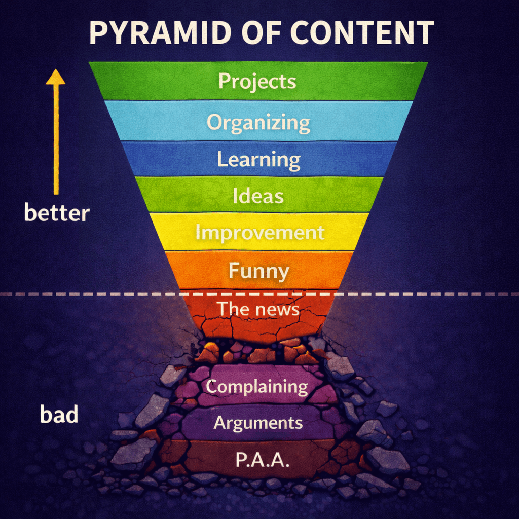
It's a genuine question, not rhetorical. I thought that the colors of the site looked a little washed. It was easy on the eyes but a lot of the colors were too similar. So I made the darks darker and the brights brighter so things would stand out a little more.
The new one looks far more aggressive.. maybe too aggressive. Your feedback would be appreciated.
I'm just going to post some pictures of both but I have this theory that people will end up liking whichever one they see second. For that reason I want you to flip a coin before looking at them.
Before:
https://img.gvid.tv/img/23p2satF.pngAfter:
https://img.gvid.tv/img/2W4NsLKt.pngWhich is better? Any thoughts on how to improve either of them?
 Log in


0F0F0F is your dominate color in the graphic space with highlights of #1711B8 for your logo and side banner. if you plug them into https://mycolor.space/?hex=%231711B8&sub=1 you can get an ok pallet and color suggestions. Then just take what you have and wash over the graphics with gradients of the highlight colors with really low opacity. Bevel, drop shadow, all that fun stuff. https://files.catbox.moe/qqhhz3.png PNG file for those who dont have photoshop.
For example
#0F0F0Fis the dominate color.I guess it could make sense since posts on the site are spacial.