 Log in

| 1 | ||
| 1 | ||
| 1 | ||
| 1 | ||
| 1 |
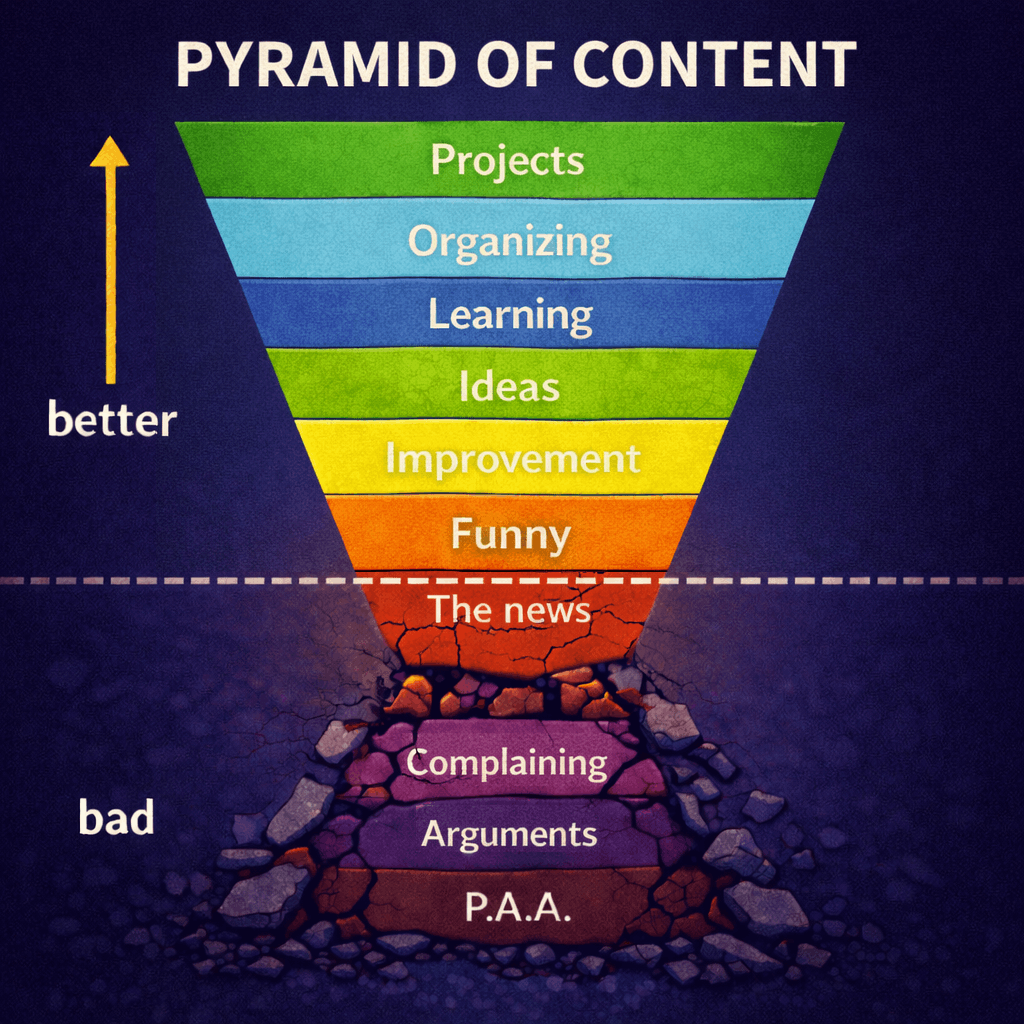
I'm starting my initiative for improved commenting UI. The goal is to drive more first and second comments in the majority of threads. While I have a long list of improvements in the pipeline, the first wave is pretty simple.
I reduced the size of the comment box at the top level from 150px to 100px. The size of a textbox often inadvertently conveys the expected size of text to submit, whether the person who created the page or the person who uses the page realizes it. By making it smaller, it invites more casual first comments.
The second-level text boxes, replying to a comment, are still the same size at 150px.
While I was at it a few other improvements came with it. One is I added an 'Expand' button to make the text box bigger. I previously picked a size I thought was comfortable for both short comments and long comments, but it wasn't ideal for either. So now it's faster to adjust it, especially on mobile.
The submit button is now separated from the others, so you don't have to scan the now larger selection of buttons to find it. That chips away another tiny fraction of friction. The boxes also do a better job of scrolling into view.
This is wave 1 and likely the lightest wave.


Does the text box have scrolling when you type more than a few lines?
Yes. But sometimes it's nice to see everything you are writing.
You have to explain to the new user what the expand button does. They also can use the preview button.
Good idea. I need hoverovers as well. In an ideal world a site is self documenting. Not that I always hit that mark. Many sites don't, and features have to be discovered over time. But there will always be new users, many of which will never see this post.
But if you are looking at those buttons, the coolest one is the add poll button.
Indeed it is.
Great. Here's a idea: make the box auto-expand once it is clicked inside of.
It's an idea, and would be a fun animation. But the point is to convey a lower expectation for write volume. Maybe it would be cool if it auto expanded when you start to run out of space when writing something longer.
That sounds like a good alternative but in that case please don't include an animation. It may sound weird but it's only a good effect if it happens upon clicking inside it. If there is a big expansion when the wall is hit it can be kind of obnoxious or like a flow is being interrupted. It's better if the box grows along with the message.